
Black Monday can now be viewed on YouTube. http://www.youtube.com/watch?v=t61VRngUCxM
In my Black Monday magazine review I tried to be impartial and unbiased, but it’s very hard to be that when you had a major part in the film’s production. I tried to make the review short but extremely detailed. In my research I found that countless film reviews followed this same technique. I also tried the review as if I never had a part in it. I tried to envision in the same way one would, if they would watch the film by themselves.
I spoke very briefly about the acting because in my opinion, short films are really about the message. However in the second paragraph I expressed my feelings about the protagonist and the overall theme. I criticised the fact that the film is simply too short to show the recession which is true. I commented on the speed in which the film changes directions. This is something we couldn’t change due to the five-minute constraint, but someone from the audience wouldn’t know this.
I tried not to nitpick when talking about the setting and the sound. I feel that I made short and accurate observations. In my research I found that most of the reviews hardly spoke about music, unless it’s portrayed prominently (e.g. a film about rap music).
I praised the setting and the characters very highly. I praised the use of the tramp character, and how he reflects the perception that society have on the homeless. Even the way how Kobina Addison is credited as only the ‘Tramp’, shows the how no one cares enough to give him a name, but on the other hand he plays a powerful, and pivotal, role in the film.
I gave a film a modest score. I took into account what the film did good, and what the film failed to capture. Compared films which equally had good and bad parts, and I found that they were mainly given two to four stars. I gave it three stars because I felt it deserved it, due to the message that was shown at the end.
Craig Perryman does it again in another fantastic performance playing John, an out of luck banker who looses his job due to the economical downturn. Joint directors Matthew Moran and Seiya Sakamoto use everything at their disposal to create a gritty real life portrayal of the current economical climate, in the same way Shane Meadows does with the skinhead culture in ‘This is England’.
The film shows John as ‘the everyman’ who goes to work like any other day, to receive the same fate of so many people. The problem here is that the film is simply too short to show such a big issue in depth. They try to by showing the character’s current lifestyle, then immediately showing his downfall allowing the audience to see a clear contrast. The issue I have with his is the speed in which it happens. It goes straight from him going to work, then him being made redundant, and then his downfall, which happens so fast that it’s simply too hard to take it all in.
The film takes place in London, in what seems to be the financial district. This seems to be adequate setting seeing that the financial district was the most affected. The sound on the other hand is a bit of a hit or miss. The film starts of with a sickeningly happy song, which goes on far too long in my opinion, to the point that it gets annoying. It also makes the character seem like the perfect human.
Talking about characters, I feel that the tramp (played by Kobina Addison) is a by far the best character. Many people in society look down on the homeless, and we can see a little of this in John. However at the end the tramp looks more human. From this we can see that it’s easy to go from well-to-do man to poverty-stricken vagrant. The film even flirts with the idea that what happened to John happened to the tramp.
I can appreciate the boss character, and the reason why the directors chose to hide his identity. He accompanies the idea that John is this everyman, so this mysterious character represents the banks and businesses that caused all the problems, as the common enemy.
The film in my opinion is very good. In such a small time frame, the directors try everything. The film doesn’t go into depth with the whole recession idea, but I’m sure they know that. What I really got from the film is how easy it is to go from having everything, to having nothing.
As we know films are reviewed differently in the magazines, blogs or even newspapers. In magazines even the layout of the review reflects the film (if it’s a double page spread for example).
In my analysis of TotalFilm’s Dirty Pretty Things review, I found that the review was quite short. I found this to reflect the budget of the film because other films with a larger budget (e.g Avatar) had more in depth review. This would prove that is a link with better scores with big budget films.
The review is written informally, but in a way in which it still remains professional. There is also a lot of little jokes, (sometimes at the expense of the film and the actors).
This review is mostly talking about the plot of the film, as if this meant to be a summary. It doesn’t talk about ‘mise en scene’ or any feelings that the film is meant to portray. However it does talk about the acting, and if the actors looked right for the part, ‘Dirty Pretty Things benefits greatly from its excellent, international cast’.
The reviewer doesn’t really describe the story. They only quickly go over it, while only mentioning the key parts. This is strange because this is the bulk of the review. It seems that they didn’t actually care about this film, or actually show much interest in it.
The conclusion of the review is short, but it summarises what the review was trying to say. This is useful for someone who doesn’t have time to read a whole review.
In this film analysis I found that there is in fact a link between film’s budget, and the way the film is reviewed. I also found out that some reviewers tend to talk about the plot a lot. In my opinion it seems more effective to talk about the whole of the film (e.g characters, actors, locations).
Source: http://www.totalfilm.com/reviews/cinema/dirty-pretty-things
We will be producing an article review for our film. We plan to carry out research on different article reviews and analyse their strengths and weaknesses. Within these articles we will be looking for how they have used article ratings, headlines, how they have reviewed the films, images, quotations and more. To produce a realistic and successful article review we will include the following features:
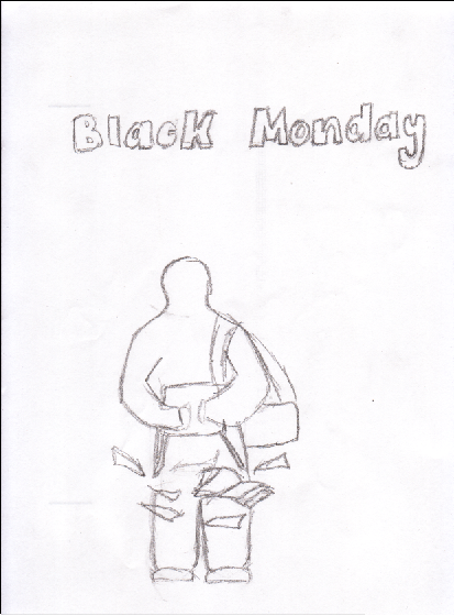
Looking at all the designs for our poster we decided to choose our first concept. We decided to use this idea for the design of our poster because it expresses the thought of Black Monday and also allows the audience to reach their own perception of the film as well. We made a few changes to the initial design of the poster by using a different font, adding an image of money and creating a distorted effect.
We allowed people to give their opinions on the film poster and recorded their comments:
Based on the comments we have received the design for the film poster was exceptional. We have managed to portray the impact of Black Monday and a feeling of despair and loss in the film poster. The colour scheme for the poster adds a melancholy contrast to the film and supports the title and concept behind our film. The text used signifies the event of Black Monday and puts forward the basis for our film.
To make improvements to the poster in future we would make the general content more appealing and add the reviews and comments of journalist’s opinions to increase its credibility.


From the Sherlock Holmes poster we can tell a lot about the film, and the audience. Seeing that this is a teaser poster, the purpose of it is to ‘tease’ the audience, we can’t tell what the genre is from a glance. From deep analysis we can find out a lot.
From the weather and the colours, we can see that this film has dark qualities, and that there are elements of sadness. The characters are a contrast to this, because they are lighter than the background. This shows that these characters are the ‘heroes’ of the film, seeing that light symbolises good, and dark symbolises evil.
Another thing we can get from this poster is what the time period that it’s set in. The clothes suggest that the film is set in the 1800s, but also suggests that these two characters are wealthy, and high in society.
There isn’t an age rating on this poster, so it’s hard to tell what the target audience is. Seeing that there isn’t any blatant use horror, or any child-like images, we know that it is around the 12a to 15 rating.
The title font is big and bold. This shows power and importance. The actors’ names are right at the top and is in bold. Compared to the size of the main title, the actor’s names are smaller. The reason for this could be because the film is about one of the most well known detectives in fiction. The creators wanted the first thing people to read was the film’s title. This also helps to generate hype.
The entire poster is made using DTP. You can see this by the way the characters are superimposed on the background. It seems that one of the characters is in front of another. This could suggest that the character plays the protagonist, and therefore is Sherlock Holmes.
 The title this time is at the top of the page this was due to the fact that the idea was meant to be funny and the font and the position would make it seem much lighter feel then the other posters.
 This poster again was meant to be a more comical poster rather then a serious one likes the first two. This was the moment in the film that was meant to be funny but it didn’t work.

Again the title has to be well visible to the audience, as this is what we found out when we did the research on posters that it is the title that should be seen the most.
The box is in this poster is important as in the film we wanted the box to symbolism the main characters life as all he works for is in that box and this feeling is what we wanted the poster to have.
The mood of the poster is meant to have been comical when we came up with the idea when we were making the film. However the comedy in the film didn’t work out so we doubt it would for the poster.

Again in this poster we want to show the name of the film very clearly so that the audience know what film that they are about to watch.
The poster again has to be dark and grey, so that the poster fits in with the theme of the movie. It was important that we used a scene that was in the film so that we capture that feeling that we create in the film
We wanted t show the tramp in the poster because he is a key role in showing the pitfalls of society today and we wanted that message to transcend into the poster.

The need is to show the title of the film clearly and that is what we want to get across
We want it to be in black and white to make it more atmospheric and this will make the poster much more of an impact to viewers.
The scene comes from a moment that happens during that film and we believe that this captures the feel of the film
Using the research carried out on film poster designs we have produced 4 initial ideas to consider the possible choices for the design of our poster. With the design of our poster we aim to portray the effect of ‘Black Monday, 1987’.
Black Monday represents the day stock markets around the world declined through the carelessness of bad program trading, finance valuation, market liquidity and market psychology. The effects of this incident caused a global crisis and unemployment had reached its highest level.
We intend to depict a feeling of loss and adversity financially through the effects of Black Monday in our poster. With the text for our poster we want the meaning of our film to come across to the audience and signify a representation of Black Monday. We also want to put forward the concept of Black Monday through the colour scheme’s used, props, content and fonts chosen. We want to target young adults ranging from 18-24 so have decided to produce a more mature design for our film poster.
The Film- When we started trying to come up with ideas for what our films was going to be about, we were thinking what do people our age struggle with at this time. We came up with the same issues that are generic to our age (drugs, crime, sex etc.), and then we thought about the biggest fear we have, the recession and the effects it will have on us students in terms of getting a job. The story came to us fast after we knew what the concept was, but as we developed the story in terms of the plot, it became clearer to us that we wanted to make a statement against the people that caused the recession and not to focus on our original student theme. We felt this was better for us to use as the message of the film. We also didn’t want to confuse the audience with too many issues and ideas. When we were thinking about the characters we wanted the main character to be a clean cut family man that gets fired due to the recession, but we felt that this character was too boring. We wanted the character to represent the greed of the bankers, and to portray the mutual idea that the public have of them. This change in character meant that a lot of the story had to change because we thought the audience would lose its feelings towards him, so we made him have a change of heart, and to realize his greed by seeing the tramp again. This is something that we would have changed if we could do it again, because we felt that the initial character was better to the story. The idea of his family featuring in the film would have made the character more relatable to the audience, but we didn’t have the tools to carry that story off (actors, sets etc.). The end is something that changed the most from the original script. We wanted the character to have a tragic decline and go buy alcohol, and realize that he has too much to lose by doing this. Unfortunately we couldn’t do this, so that’s another thing that we would have changed. We feel that the story would have been more emotional, and the audience could relate better to it, thus making it more entertaining for the audience. As a film we as a group felt that it tells a story that we wanted to, and it proved to be a powerful statement against the bankers, and the way they are perceived by the public. On the other hand we did sacrificed a lot to tell the story. Most of the things we wanted to do was replaced by the political statement that we wanted to tell are audience.
The Blog- The Blog was something that was new to us as a group because we haven’t used something like this before. It took some time to get used to constantly updating the blog, as in previous years we could wait to the end to do all the paper work, but the blog had to be updated all the time. What we found as a group with this course was the freedom that we had when coming up with the idea for the short film, because the specification said we had to represent the UK today, and it had to be approximately five minutes. This was great because we had creative freedom, and we also felt at points we took that freedom too far and let are imagination get the better of us. We didn’t think about how we would make this film, but we soon came to a decision that we wanted to focus on the recession. The greatest help to us during the course was the media textbook, as it explained a lot of what was being asked of us. This information was priceless, particularly the story of the girl making the artwork for her CD case. In our course what was of great help was the short film analysis, because until that point no one in the group had seen a short film let alone understand the conventions of one, but when analyzing a few it became apparent that it was the themes that were important to the success of a short film. This is due to the lack of time you have to develop the characters, so we realized that in a five minute film the theme has to be clear and fast-paced. The character has to be developed very quickly in the opening scene, and then we can develop him as the story progresses because the audience is unable to form an attachment to the character. We wanted to character to be someone that the audience don’t like because that is an emotion that is easier to create, especially because we didn’t use any professional actors so this causes it own problems. The Blog we feel is a good way of doing the coursework because it is like a diary into how the project is going, and as we look back we can see the changes that we went through in this project.
The lighting for are project was something that we found very important in terms of telling are story we wanted pathetic fallacy; the weather was something we identified as something we could use to create the moods we wanted.
At the start of the film we wanted the weather to be clear no clouds as this will show the clearness of the characters mind no worries the ease that he is feeling about his life. The sun should be out as it would show the happy upbeat mood that the character finds him, this could be translated to the audience. We wanted the lighting to be bright and the character to be clear to the audience and for the sun rays to hit the character as he walks to work.
Then to the end of the play we wanted the weather to change become gray and darker and light to become greyer and more miserable to represents the change in the characters mood, he has become more consumed in his problems unlike before. This would have been good for the audience as it shows them the contrast between the two halves of the film.
However when it came to filming we suffered from the fact that time and the weather was against use, when it came to filming the opening scene it was during winter so days when it was clear and sunny was rare and it became impossible to get the clear opening scene that we wanted. Even though this was the case we managed to get that weather for the last scene of the film which is good enough as that is the point of the film were we really needed that scenes of pathetic fallacy but there just would be no contrast between the two halves of the film. During the office scenes when he is indoors we used the lights that we had available such as the office lights we wanted that feel of the working environment there being light but not too much.
Plot- We changed the plot the most; this was mainly due to the fact that we had no place to film the end scene which was in the shop. So we decided to change the end and make the main character see the tramp again after being fired and realising that the greed that he showed before was wrong and that that he could end up in the position were the tramp is. This change to plot changed the whole meaning of the film and we needed to think up a new morale to be story because originally it was about there being more than money and now it is the link between all of use.
Character- The main character took a massive change from the original John to the one that is in the film. Originally we wanted him to be someone that had money and was a family man that was kind hearted and was a victim to the recession, but when we thought about it we didn’t feel that the message of what we felt towards the bankers was strong enough so we changed the character of John to a person that was greedy and wasn’t interested in helping others, this we thought was the best suit when it came to the audiences idea of business people at the time. The Boss was another character that we played around with as a character before we settled. We initially wanted him to be someone with a lot of power and respect and were very focused on figures and getting the job done this we felt fit the convention of a big boss perfect. However we felt we could challenge this convention by making the boss lazy and uninterested in work. We wanted to show the incompetence of the bankers and the people that got the country in the mess it’s in and where the ones paying for it.
The way that we conducted this research was to ask 4 people that were in the age group that we targeted as being the audience that this film should appeal. We asked them 5 questions, the research was qualatitive information that we gathered. We just showed them the film we didn’t tell them anything else.
Q1. What did you think of the film?
1. I felt that the film was well done and was very easy to follow the story; this was because of the fact that it was all shown in terms of it being on day and not spread over a period of time. I like the characters that they had in the film it was easy to understand their stories.
2. The film was a bit too basic in terms of the story; there was no depth to the story or the characters. I felt that it had no really meaning or motive. The story of the character being fired was too basic and I was disappointed in the character development.
3. I thought that the film was good considering it was only 5 minutes in getting the story across; I thought that the opening sequence was really good. The tramp character I felt gave the story some depth which was a good touch.
4. The movie was okay, but I felt that the characters were a bit too under developed, I didn’t feel any real connection with him and when he got fired I didn’t have any feeling. The boss was a good character and I like the way that he came across as being lazy this was a good contrast to the way I thought he should be.
Q2. Is are reflection of modern life in the UK accurate?
1. Yeah, the way they did it makes it seem like it was about the recession. It was the way the boss was talking in the office to the main character about cuts that had to be made.
2. The story didn’t have any real connection to me in terms of how the UK is at the moment for me. Maybe if they focused on crime or poverty that people in London suffer from because a lot of people can relate to that.
3. The recession is something that I’m concerned with at this moment in time. At the moment I work and am just out of uni so I’m worried that if the company was to start making people redundant then I fear I’ll be first to go.
4. The theme that they opted for was a good one because the recession is a big factor today, but the way they did it seemed like it could have been during any period of time and not just during a recession.
Q3. What are your feelings towards the main character?
The main character I felt was very interesting because I was interested in him at first, then he was mean to the tramp and my feelings were gone. I ended up feeling no emotion to the character at all and when he was fired I felt like he got what he deserved.
The main character wasn’t a very good character because I felt nothing towards him. He was just someone to keep the story going. I felt that they could have given him more of a back-story because we knew nothing of him apart from the fact he works, no family or depth to the character.
The character was clever because I felt anger towards the character because of the way that he treated the tramp. It was good the way the story worked out that it seemed like it was karma, the way he was mean to the tramp and then he was punished.
The character was the driving force of the whole story and the other character added in the telling of the story. I thought it was interesting the way that the story changed due to the characters apart from the main character and showing the impact those characters had on him.
Q4. What have you taken away from this film?
I have realised that we should care about people that are in need because you never know when you will need help. That’s what I felt when I saw his film, that when he treated the ramp bad that he got what he deserved.
I took away that we have to be more caring to people that need are help, I felt like this was the main theme of the film.
I realised the depth of the problems of the recession and seeing it at such a personal level showed the potential effects of the recession. Although it was short and not professionally done, the film still raised good points.
The film made me think about the way that I treat people in the real world and the way that I react to my co-workers. This film has shown me the importance of being someone that understands the needs of others.
Q5. What would you rate this film out of 5?
3
3
4
3
Conclusion
To conclude the audience seemed to understand the story, they got that the theme was the recession and how the main characters misfortune was linked to the way that he treated the tramp. Although they commented on the production of the film they seemed to be able to look past this and see the message of the film. It was important for uses that are film was able to connect with are audience and the fact that most of are audience did realise and relate to the film as something that they were concerned with.
We used various props to assist with the mise en scene of the film. We used different props in areas of clothing, personal items, settings and more.
Clothing-John
We utilized different props to assist with the clothing of the characters.
The protagonist John represents a businessman. Because of this we intended to implement a professional look into his character.
Glasses: This prop has been used to make the character look more sophisticated and highly educated. This prop has also been used in the poster for our film.
Suit: The character wears a suit to work to signify he is employed in an exceptional organization. The suit he wears has been worn neatly to show he makes an effort to meet formal standards but still keeps his dress sense simple.
Shoes: The shoes that the character wears have been used in our film to give more Intel on the character’s personality. The shoes imply that he is casual, calm, relaxed and dresses in what he finds comfortable. They reflect his personality to show he is young and in touch with current fashion trends. It also suggests his status within the organization he is employed at, showing he is at a low branch in the business and the dress code is less formal.
Bag: The character wears a satchel bag used to suggest he is carrying important files and documents. This is a common business bag worn by working class, which is why we used this in our film.
Coat: The character wears a long heavy coat. This signifies that the weather is quite cold. The coat also doesn’t have a brand name to avoid the thought of the character existing as a teen and to present him as an adult.
Clothing-Tramp
The tramp represents a homeless man. Because of this we intended to make the character look scruffy and less fashionable.
Hoody: The character wears a hoody as an under garment to keep warm. As the character is homeless he carries what is most essential.
Scarf: The scarf we chose was utilized to develop the characters appearance and make him look run-down.
Glove: The character wears gloves that are torn showing the minimum access he has to decent clothing.
Coffee: This prop has been used in the opening scene of the character’s (John) day to emphasize how stress-free the character is feeling
Wallet: This prop has been used to enable the character to hold important items such as credit card information, money, job identification and personal items.
Books: This prop has been used to develop the individual’s character and show he is intelligent.
Bear can: This prop has been used to boost the common image that people see of homeless people. It also adds impact to the situation he is in when he is refused money.
Music
Non-diegetic music has been incorporated into the film to create a relaxing mood in the opening scene, suggesting his day is going well.
Non-diegetic music has also been incorporated into the film to create a mood suggesting the character is distressed. This has been used in the last scene of the film.
John (Main Character) - He is the main character and it is his story that we are telling in the film. It is a day in the life of him as we see him get ready and as he gets fired. He as a character represents the greed that the bankers showed before and during the recession; he is what we as the public perceive them to be like. The character although has this level of greed we show that he has the same fears as everyone else during this downturn but only realises this when he is meet by the tramp. The clothes that he is wearing is a suit which fits the mise en scene of someone that works in an office, however we showed him using transport which some people have suggested doesn’t fit this idea that he has money, but we felt that many people in London use the transport system that we have so this is a better fit to this convention.
Tramp – This character is a representation of the public during this economic downturn, and the way that the bankers have treated us during this recession only looking out for themselves and showing the level of greed that they have. The tramp has a massive part to play in the film as he is the character that shows John for what he is which is greedy. The tramp is the only character that the emotions and thoughts of the main character are provoked from, like in the final scene. At the start the tramp was a little character that just gave some insight into the main character but he became much more important to the story as we developed the script into more depth. The clothes that the tramp is wear fit the mise en scene of the tramp because he is wearing old dirty clothes and has a can of alcohol in his hand which fits the convention of what a tramp usually looks like.
The Boss – The boss although not a big character what he represents is vital to showing what we wanted to tell in the story. We wanted at the start of doing this film to make the boss very powerful and important because we felt that would best suit the mise en scene of that character and that is the convention that we believe a boss to be. However when we thought about it we wanted to challenge this convention, so we made the boss to sound lazy and uninterested in work during the telephone monologue that he has. We see the boss in his office with a suit and an expensive computer on his desk this fits the mise en scene that we wanted to convey when we made the film.


